Apple Essential Design Principles - Part 1 • Wayfinding
Dec 4, 2024

Following is the exact words from WWDC17 session presented by Mike Stern, Design Evangelism Manager at Apple.
— — — — -
at Apple, we often use the term human interface to describe
what might otherwise be called user interface. Human interface is an uncommon,
not widely used term, but it has a really long history at Apple.
Our design documentation, this is the newly redesigned macOS HIG, it is called the Human Interface Guidelines.
The word user can have a clinical or anonymizing effect. It narrowly defines people in relation to the interface. Human evokes a much more nuance picture of who it is that we are designing for. If I say I’m only human, it is to acknowledge that I have imperfections, and I have
shortcomings. I might fall short of your expectations of me. Hopefully not right now.
But the word human is also how we express our highest and most noble qualities. When you acknowledge someone’s humanity, you’re recognizing their kindness, their compassion, their generosity and goodness.
Designing an interface is fundamentally about serving other human beings.
The goal isn’t to make a beautiful app, or a well-organized app, or a simple app or a focused app.
Those things are all really important, but they’re not the real goal. The real goal is about serving
the human beings or positively affecting the lives of the people who use the apps that you
make. The only thing that really matters is how well your app
satisfies the emotional and practical needs of the people you are designing for.

Every one Needs to :
Feel safe
We have the need for safety and predictability.
Understand
We have a need for knowledge, for meaning, and understanding.
Achieve
We have a need to accomplish tasks, to achieve our personal and professional goals.
Experience beauty
We have the need to experience beauty and joy.
Well-designed apps should provide these things.
Apps should provide :
Predictability and stability
Well-designed apps make it easy for people to predict the consequences that their actions will have. They feel stable, solid, trustworthy.
Clear and helpful information
They help people to make informed choices by providing information that is clear and helpful.
Streamlined and simple workflows
They have streamlined and simplified workflows, so that people can effectively and efficiently accomplish their tasks.
Delightful experience
They should have an aesthetically pleasing, enjoyable, and even delightful experience.
Using apps that provides these qualities is so gratifying, so satisfying, you can tell that the people who made the app fully considered your needs.
You sense all the time and all the effort that went into figuring out how to help you get things done quickly and successfully. Everything is there for a purpose. Everything is understandable. It just feels so human.

Design principles don’t tell us how to do specific things in our
design, they tell us why we should do those things. They serve as the foundation upon which great designs are built.

Let’s go on a trip.
Because design principles are universal, I thought it would be fun for us to explore how these design principles shape our experiences in the real world.
Now, there really is no better way to explore the real world than to travel. So, with that in mind, I thought we would all go on a little trip together.

All right. Let’s go. Now, our journey to lovely Hawaii is going to begin
somewhere slightly less lovely, at the airport. As we approach the airport, we are going to see all sorts of signs. At first, we see signs about how
to get to our terminal.
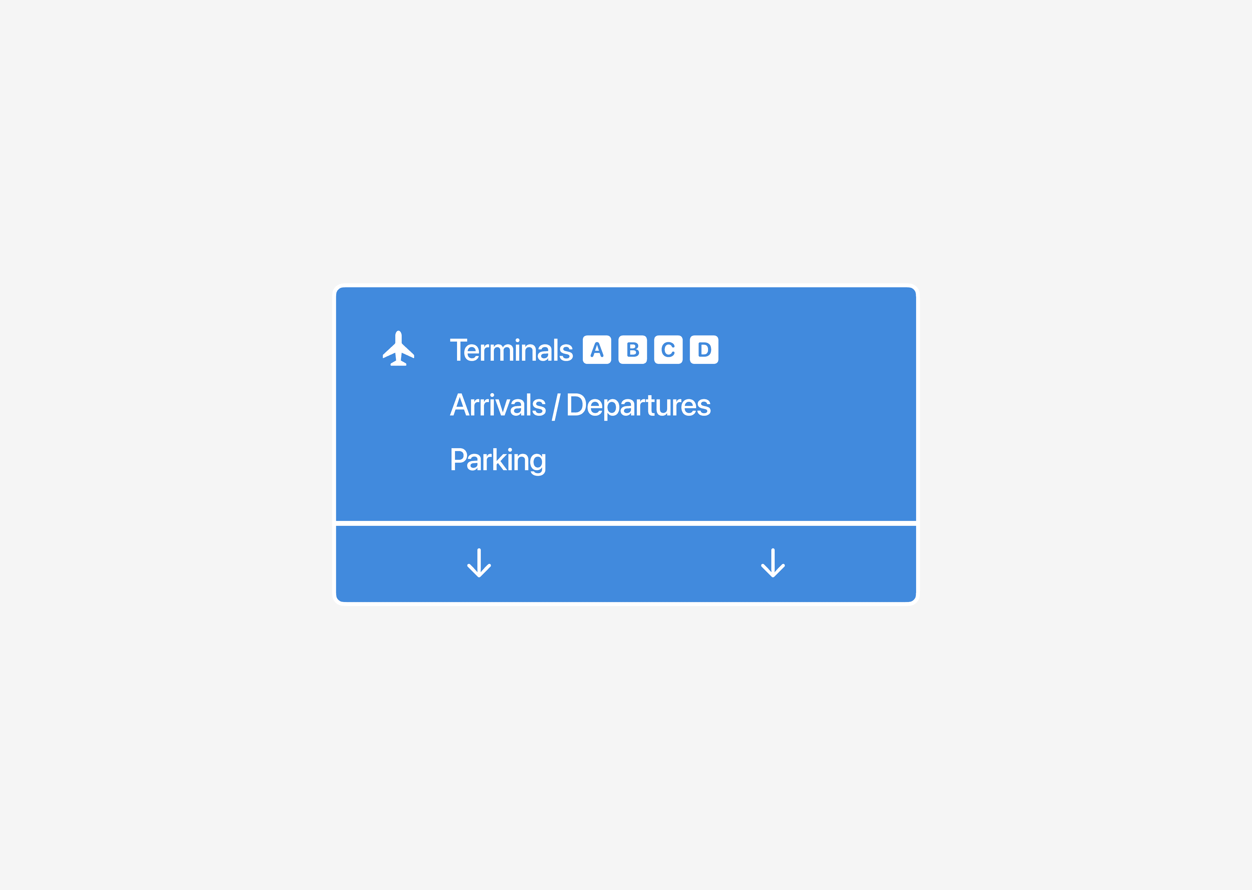
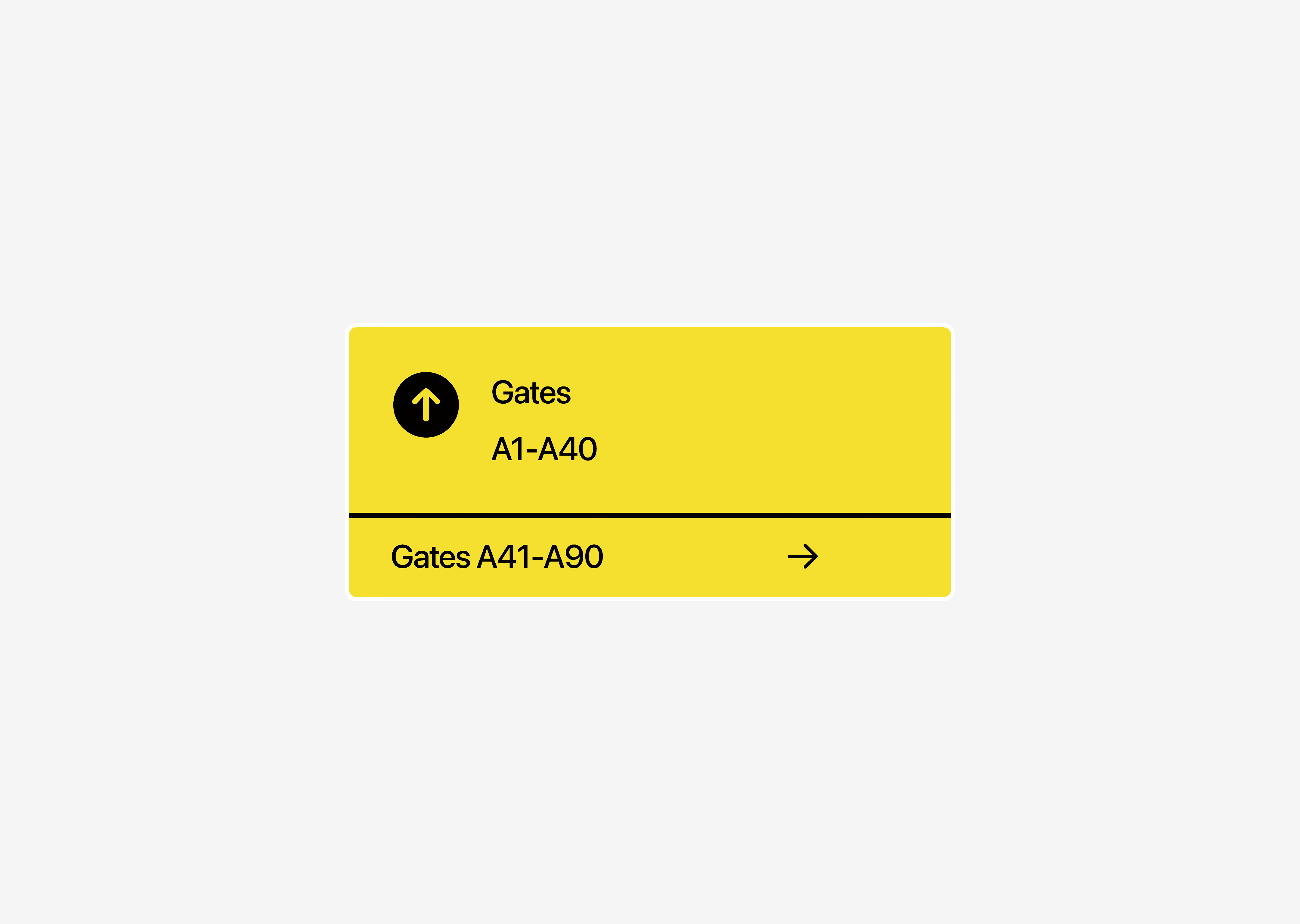
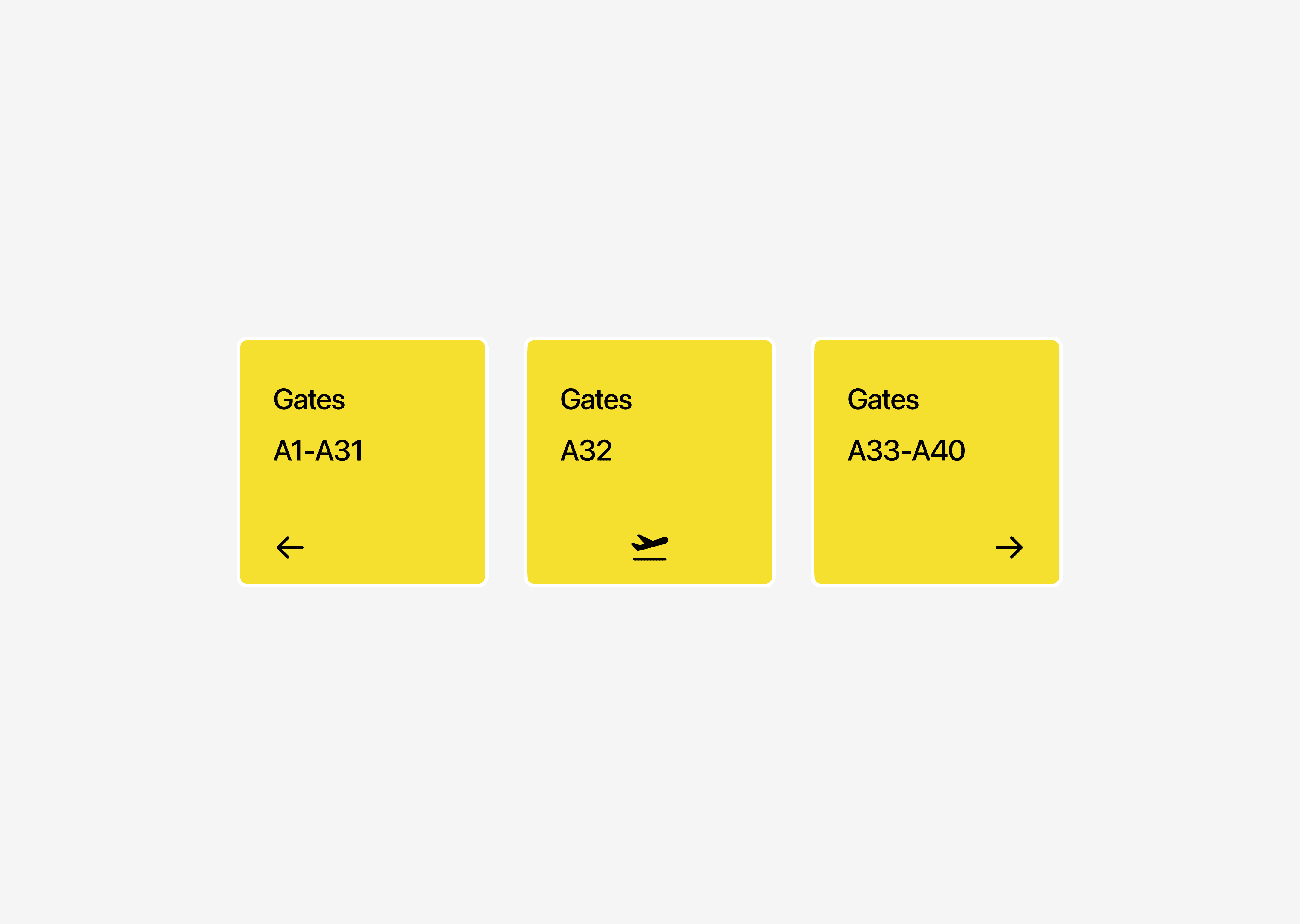
Then we see signs that provide more specific information about
what’s at each terminal, and after we find our terminal and park, we head into the terminal, and then we get directions to our gate. And once we get to our gate, we are going to know we’re in the right place, because there is a big old sign telling us so. And if we are in the wrong place, or if our flight was moved, we get directions to nearby gates.

And in case there is an emergency or we just want to leave, nearby exits are clearly marked.

The system of signs that we followed is what is called a
wayfinding system. Wayfinding systems help people to navigate complex environments quickly and successfully. They are critical for helping people feel oriented and safe.
People at airports are tired, they’re jet-lagged, they’re in a rush, they’re stressed out. So airports need to think really deeply about wayfinding.
Good wayfinding systems offer a comprehensive and understandable list of general locations that people can visit. They provide needed detail about what’s in those locations. They are highly contextual. They become increasingly specific as we navigate deeper and deeper into the system. They help people to orient themselves by clearly highlighting their current location relative to other locations. And they provide a clear exit path. It’s so comforting to know that you can return to a place that is more familiar and start over. Without answers to questions like these, we’d be lost.

Wayfinding answers :
Where am I?
Where can I go?
What will I find when I get there?
What’s nearby?
how do I get out?
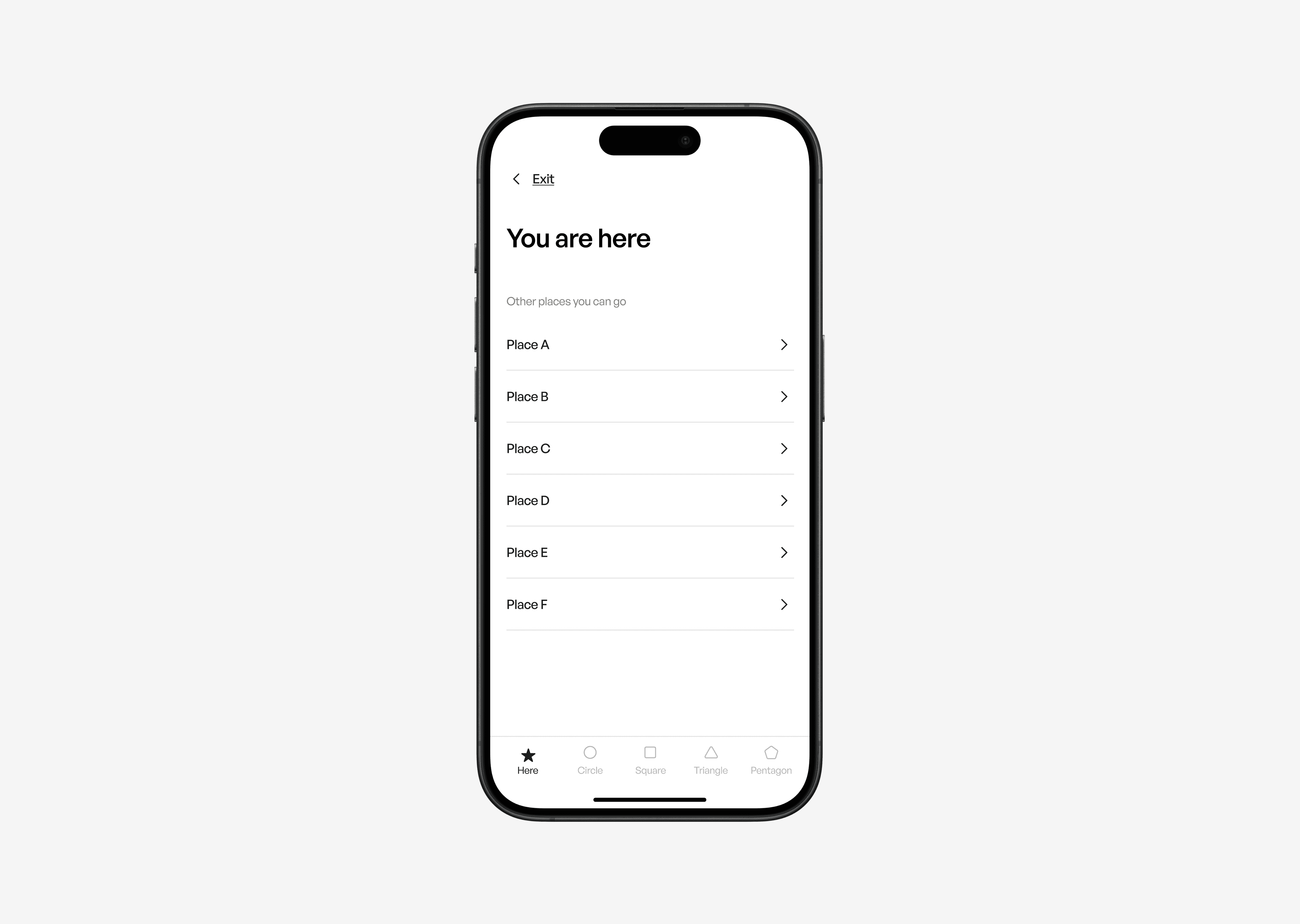
Mockup designed by Sigma Design System 2
Now, your app’s interface is really just one big old wayfinding system.
The navigation bar, the content area, the tab bar, they’re all just tools for providing wayfinding in your app.
The navigation bar title and selected tab bar item lets people know where they are.
Tab bar in content areas lets people know where they can go and what’s nearby. Simply rendered and recognizable
tab bar glyphs and understandable labels suggest to people what they will find when they get there.
And back buttons offer an exit route, and can help people to identify what area of the app that they’re in.
Now every screen in your app should answer all of these questions, or else people will feel lost. So go through your app. Go one screen at a time, and ask yourself, how well is each screen answering these questions?
Does every screen help people to know where they are? Does every screen help provide options to people to tell them where else they can go? If some screens aren’t answering those questions clearly, then there is some work to be done.
— — — — — —
End of part 1
Collected and Designed by Ameer Omidvar designer at Sigma.
2025 Sigma. All rights reserved. Created with hope, love and fury by Ameer Omidvar.