Best Ecommerce Sites for UX in 2025 (And Why They Work)
Apr 16, 2025
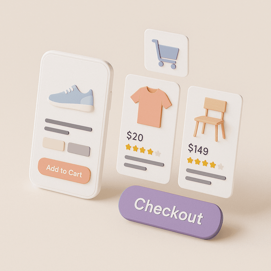
When we talk about e-commerce, we usually talk about performance — speed, checkout flow, cart abandonment.
But behind every great metric is something deeper:
A user experience that feels effortless.
In this post, we’re looking at the best ecommerce sites for UX — and more importantly, why they work.
These aren’t just beautiful storefronts. They’re built on structure, trust, and smart design decisions.
🧠 1. Apple
Apple’s product pages are masterclasses in progressive disclosure:
Focused headlines
Bite-sized specs
Clear CTAs per screen
Consistent rhythm across devices
The magic isn’t the visuals — it’s the restraint.
Nothing feels like a surprise, and that’s why it works.
🔄 2. Everlane
A strong example of how UX supports brand values.
Minimal UI, but rich storytelling
Sustainable product info surfaced early
Seamless filter interactions
Transparent pricing interactions
This is a great case of UX as a trust builder.
🧱 3. Allbirds
The mobile experience here is especially strong:
Fast, uncluttered scroll
Always-visible “Add to Bag” CTA
Simple, yet helpful product descriptions
Smart use of color + sizing variants
Allbirds respects short attention spans without sacrificing clarity.
🧩 4. Asos
Great e-commerce UX doesn’t have to mean minimalism.
Asos is high-volume, high-energy — but still usable.
Flexible filters + sorting
Well-placed reviews and social proof
Good microinteractions during load or errors
Clear progress indicators during checkout
The site is loud, but structured.
📦 5. REI
A favorite on Baymard's UX benchmark — and for good reason:
Structured product hierarchies
Detailed product comparison
Checkout flow that works for guests
Helpful returns + policy clarity
REI’s UX doesn’t try to impress — it works hard to earn trust.
🔍 Key UX Principles They Share
Looking across these examples, a few things stand out:
PrincipleHow it Shows UpClear visual hierarchyEvery screen knows what should come firstProgressive disclosureInfo appears when you need it — not beforeBehavioral flowUsers are gently guided toward decisionsFeedback loopsErrors, confirmations, and changes are clearTrust-buildingPolicy info, reviews, and guarantees are visible
If you're designing or auditing your own store, use these as UX checkpoints — not just design inspiration.
🧠 Want to Build Smarter UX Into Your System?
Check out User Psychology 3 — a Figma-ready kit of behavioral UX principles and UI patterns that help e-commerce teams build smarter flows, better forms, and more trustworthy experiences.
And if you're scaling your store across teams? Sigma Design System gives you a modular base to build consistent, simple, fast interfaces.
💬 Final Thought
The best ecommerce UX isn’t loud.
It’s calm, confident, and considerate.
So if you're building or improving a product page, cart, or checkout flow, don’t just copy what looks good — study what feels good to use.
Because when you get UX right, users won’t just buy — they’ll come back.
2025 Sigma. All rights reserved. Created with hope, love and fury by Ameer Omidvar.