What Makes a Great E-Commerce Web Page in 2025
Apr 15, 2025
E-commerce is no longer just about selling products.
It's about building trust at speed — across different screens, personas, and buying moments.
The best e commerce web pages today aren’t just beautifully designed. They’re frictionless, focused, and behavior-aware.
Here’s what separates the good from the high-converting.
🧭 1. The Hero Does All the Talking
In e-commerce, first impressions are sales tools. The hero section needs to answer three questions instantly:
What is this?
Who is it for?
Why should I trust it?
Take Allbirds or Outdoor Voices — their landing views are calm, product-focused, and confident. You don’t scroll to understand — you see it.
🎯 Tip: Your best product photo is worth more than any headline.
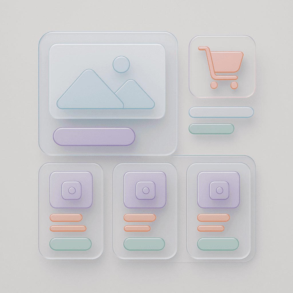
🛠 2. It’s Built on a System, Not a Template
Many e-commerce pages rely on drag-and-drop templates — and it shows.
The best teams build with a system-first mindset:
Grid that adapts to content
Color tokens with brand meaning
Reusable cards and sections
Predictable hover + scroll states
We followed this approach when creating the Sigma Design System — because a modular system doesn’t just save time. It builds trust through visual consistency.
🧠 3. Every Section Earns Its Place
E-commerce pages are often packed with noise:
Too many CTAs. Too many fonts. Too many choices.
The best ones? They’re edited with discipline.
They follow a clear hierarchy:
Value
Product
Trust
Offer
CTA
No fluff. Just flow.
Want to improve this? User Psychology 3 helps you spot and fix friction points using behavior principles like choice overload, commitment, and perceived value.
📦 4. Product Pages Are Landing Pages Too
In 2025, product pages do the heavy lifting — especially in DTC.
That means they:
Tell the story (not just list features)
Answer objections (shipping, returns, materials)
Use structured content (tabs, accordions, icons)
Load instantly on mobile
Look at how Everlane or Glossier structure theirs — scrollable galleries, expandable sections, and trust indicators built into the flow.
📱 5. Mobile Is the Default, Not the Afterthought
It sounds obvious — but still isn’t done well.
A great e-commerce web page on mobile:
Keeps the CTA always accessible
Prioritizes thumb-friendly tap areas
Simplifies navigation
Compresses story without cutting it
🎯 Test your page on a slow network. If it still works, you’re on the right track.
💬 Final Reflection
Great e-commerce design doesn’t sell harder.
It removes more friction.
So whether you're building a new store or refreshing a single PDP, ask:
Is this clear at a glance?
Is this system-backed?
Is this behavior-aware?
If the answer’s yes, you’re not just designing a web page.
You’re designing trust.
2025 Sigma. All rights reserved. Created with hope, love and fury by Ameer Omidvar.