Top 4 Figma UI Kits & Design Systems in 2025
Mar 29, 2025
Designing great user experiences is as much about efficiency as it is about creativity. The right Figma UI kit or design system can turn hours of tedious work into seamless, elegant designs. In 2025, UI/UX designers are demanding more than just pretty components—they want flexibility, scalability, and documentation that makes collaboration effortless.
After exploring the best in the industry, we've curated the top four Figma UI kits and design systems that are setting the standard this year.

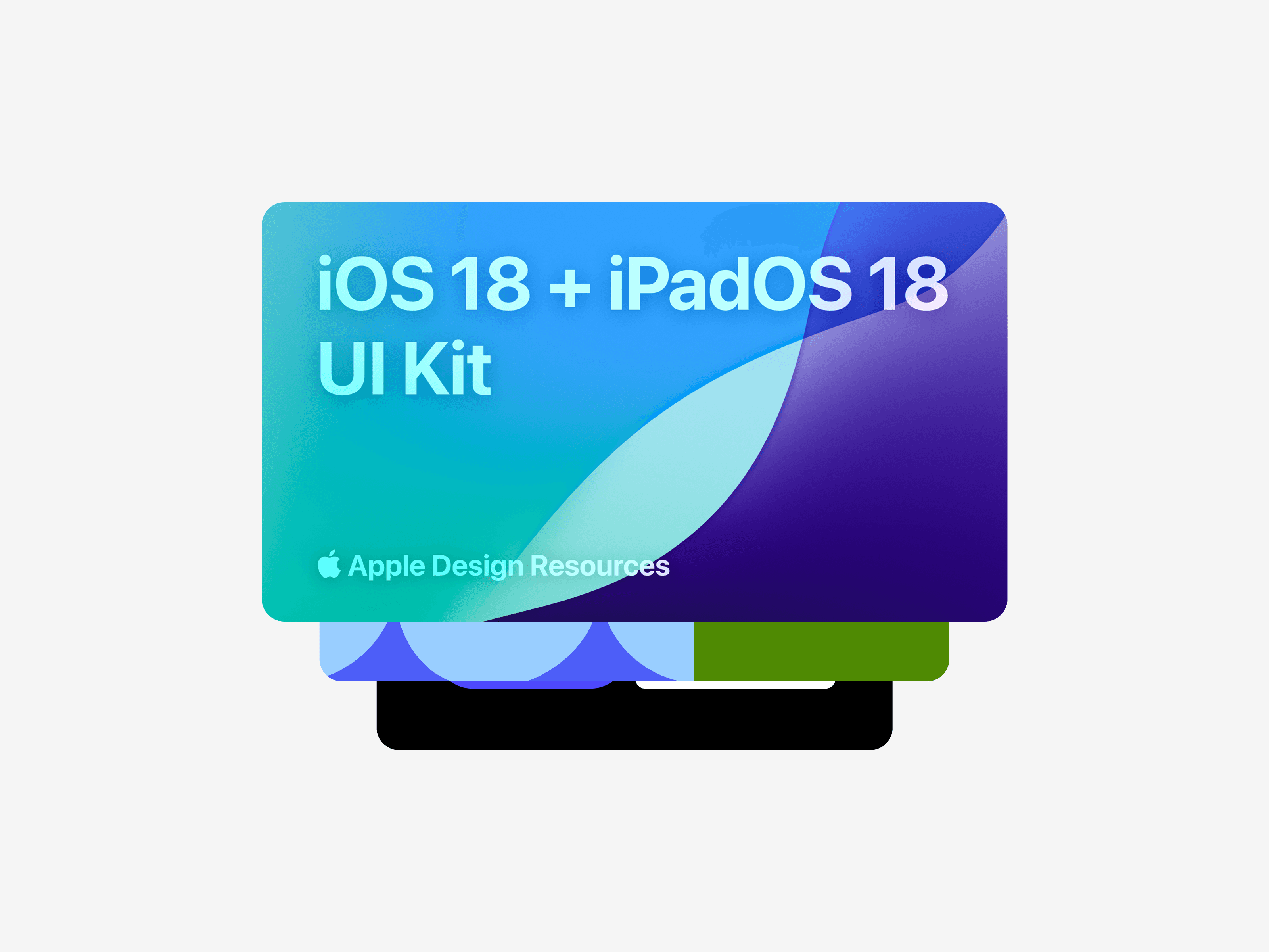
1. iOS 18 and iPadOS 18 UI Kit – The Apple Standard
Best for: Designers creating applications for the Apple ecosystem.
Apple's iOS 18 and iPadOS 18 UI Kit provides designers with a comprehensive set of resources to design apps that align seamlessly with Apple's latest operating systems. This kit includes official design templates, icon production files, and color guides, ensuring accuracy and consistency across iOS and iPadOS platforms. To utilize this UI kit, designers need a macOS device and access to the SF Pro font, which is integral to Apple's design language.
👉 Access Apple's Design Resources
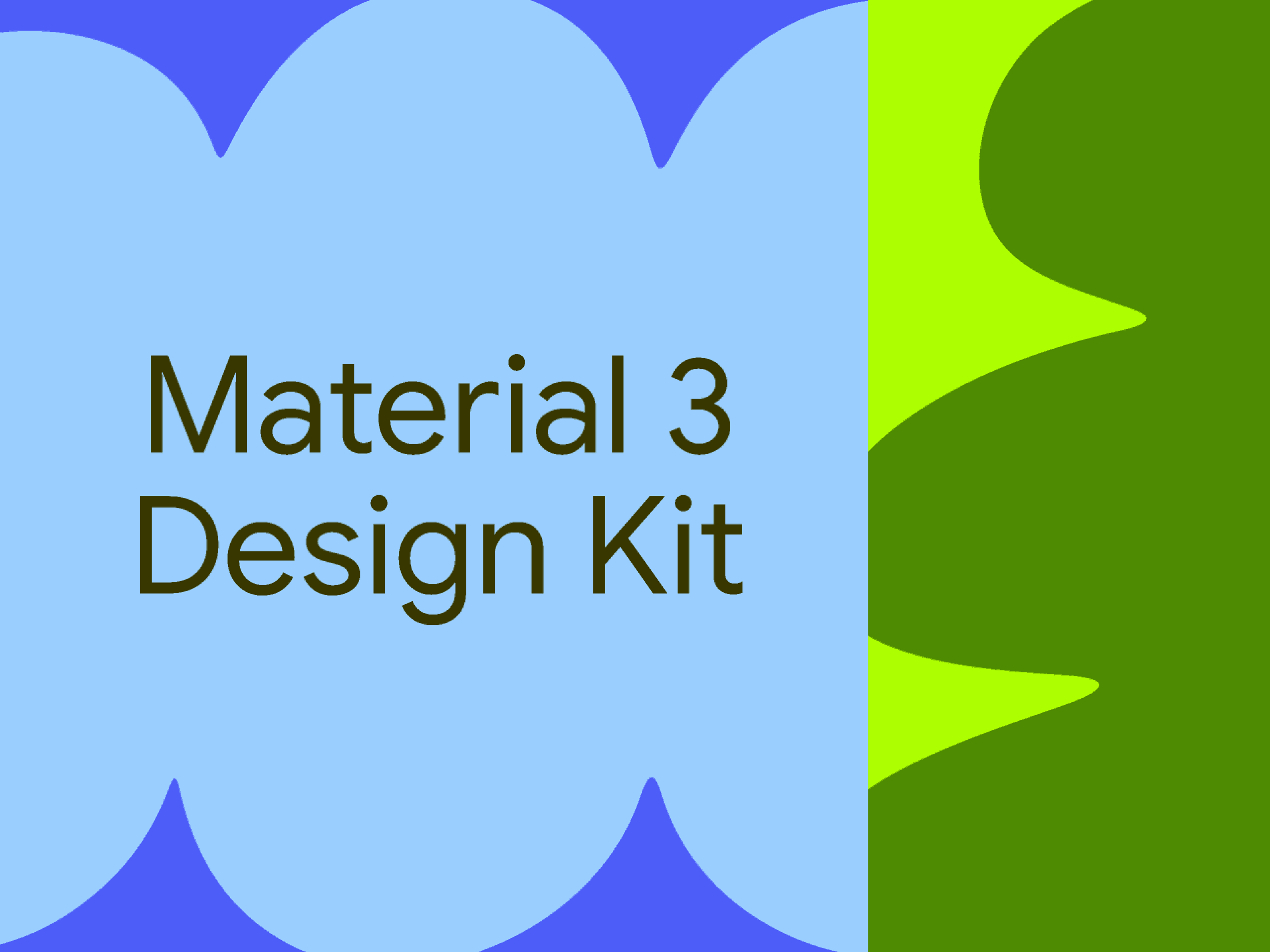
2. Material 3 Design Kit – The Android Standard
Best for: Designers working within Google's ecosystem.
Google's Material 3 Design Kit continues to set the benchmark for Android UI design. The 2025 update introduces adaptive components, dynamic color theming, and enhanced accessibility features, making it the preferred choice for designers seeking seamless integration with Android's design language. This kit enables the creation of intuitive and responsive interfaces that resonate with Android users worldwide.
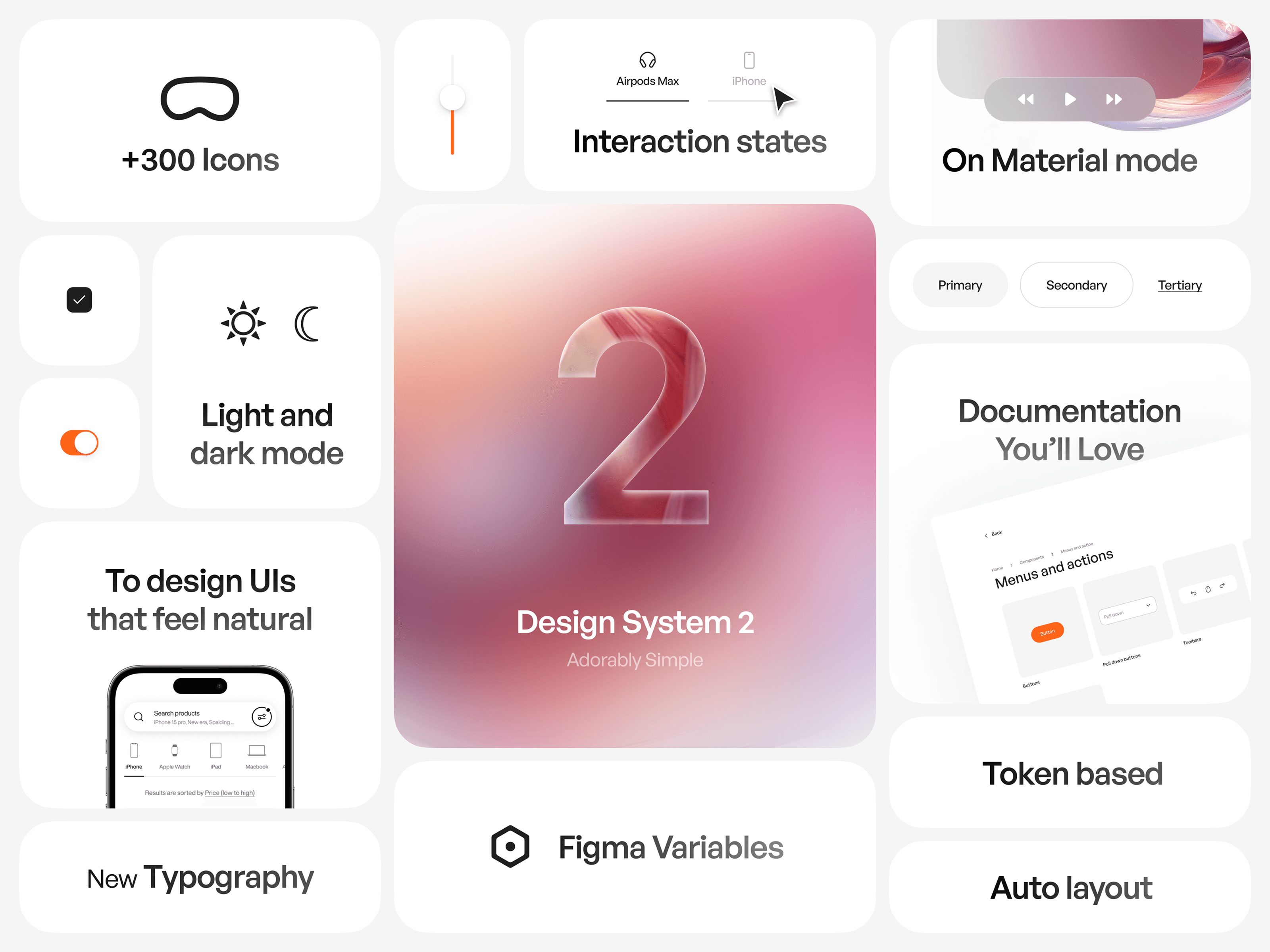
3. Sigma Design System 2 – Elegance Meets Simplicity
Best for: Designers seeking high customization, clarity, and comprehensive documentation.
Sigma Design System 2 is more than just a UI kit—it's a design philosophy. Built on principles of simplicity, exceptional documentation, and extreme customization, it empowers designers to craft experiences that are both intuitive and polished. Each component is meticulously designed to exude effortless elegance, whether you're constructing a sleek dashboard or a complex application. The introduction of the 'On Material Mode' adds a glass-like surface effect, ideal for creating depth in spatial interfaces.
👉 Discover Sigma Design System 2
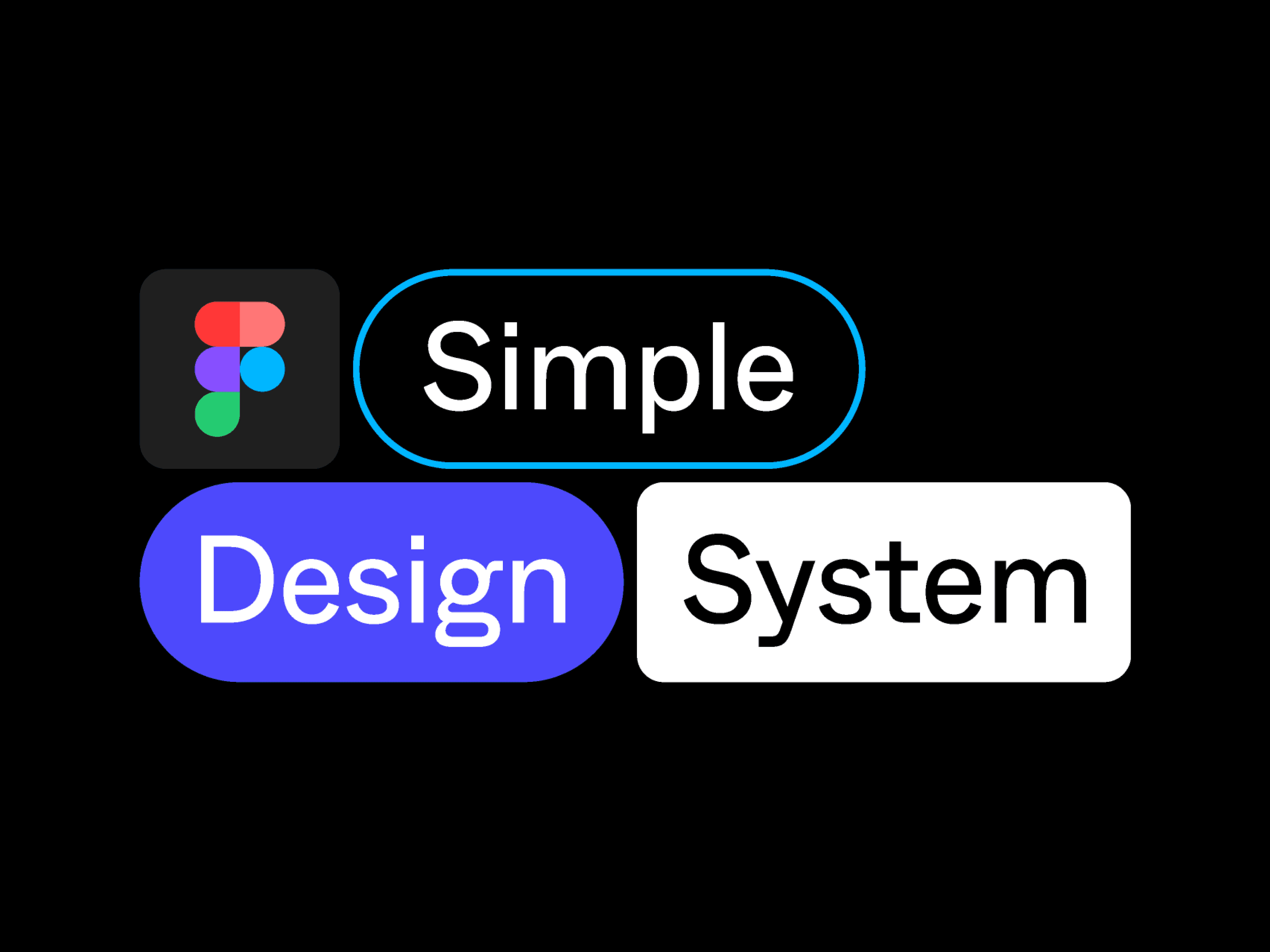
4. Simple Design System (SDS) – Bridging Design and Development
Best for: Teams aiming to synchronize design and development workflows.
The Simple Design System (SDS) serves as a foundational design system that demonstrates how Figma's Variables, Styles, Components, and Code Connect can be integrated alongside a React codebase. SDS addresses the common gaps between design and development, offering best practices for creating responsive web designs that are both customizable in design and honest in their code implications. This approach ensures a cohesive and efficient workflow for teams striving for consistency across design and development stages.
👉 Explore the Simple Design System on GitHub
Final Thoughts
Selecting the appropriate Figma UI kit or design system depends on your project's specific requirements and the platforms you're targeting. Whether you need the customizable elegance of Sigma Design System 2, the platform-specific resources of iOS 18 and iPadOS 18 UI Kit, the comprehensive guidelines of Material 3 Design Kit, or the integrative approach of the Simple Design System, these top options for 2025 are designed to enhance your design process and elevate the quality of your user interfaces.
2025 Sigma. All rights reserved. Created with hope, love and fury by Ameer Omidvar.