What Makes a Great Landing Page in 2025
Apr 15, 2025
Landing pages used to be just sales tools.
Now, they’re product demos, brand statements, funnels, and even onboarding flows — compressed into a single scroll.
But in a sea of sameness, what makes a landing page actually land?
This isn’t a list of templates or hacks. It’s a breakdown of what the best landing pages in 2025 do — and why they work.
🧭 1. They Make One Promise, Not Three
The best landing pages don’t try to do everything.
They guide the visitor toward one core action — signup, explore, download, subscribe.
Everything else fades behind that goal.
They don’t bury the CTA under scrolls of fluff. They lead with clarity.
Sites like Linear or Superlist get this right — you know what they do, and you feel it fast.
🧠 2. They Think Like a Funnel
Great landing pages are layered like stories:
Hook
Problem
Value
Features
Proof
CTA
They meet curiosity with just enough frictionless guidance.
Each scroll adds just the right amount of context.
It’s like a conversation, not a pitch deck.
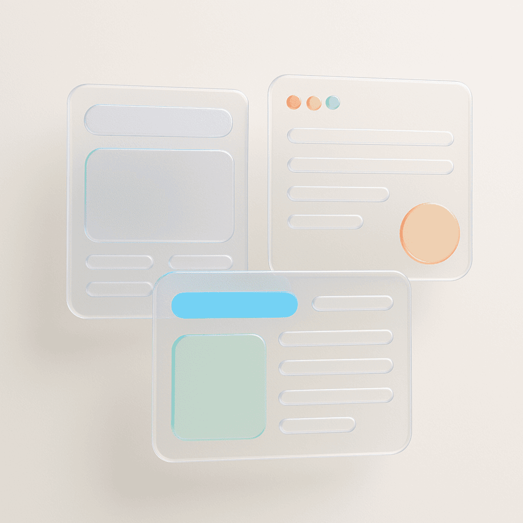
📐 3. They Use Design Systems Without Looking Boring
Most landing pages feel like they came from the same starter pack.
But the best ones balance structure with signature.
They use:
Scalable tokens
Grid logic
Typography that carries tone
Color roles that build rhythm
That’s the philosophy we followed in Sigma Design System — building layouts that scale, but still feel alive.
🧬 4. They Reflect Behavior, Not Just Aesthetics
People don’t read landing pages like blog posts.
They scan. Pause. Click. Scroll.
That’s why behavior-focused design is key:
Microinteractions on hover
Value props near scroll triggers
Social proof near CTAs
Smart defaults in input fields
If you're designing these interactions without behavioral cues, User Psychology 3 can be a huge shortcut — it's built to bring those invisible decisions into your system.
🎯 5. They’re Made to Be Shared
The best landing pages aren't just designed for conversion — they’re designed to be passed around.
Strong visuals for social previews
Clean metadata for SEO
Instant loading
Clear URL slugs
It’s not just about the user. It’s about the next user they bring.
💬 Final Thought
A great landing page doesn’t overwhelm. It doesn’t sell.
It invites.
It holds focus. Tells a story. Builds trust.
And lets the product speak louder than the interface.
If your landing page feels bloated, noisy, or templated — step back.
Ask what one thing it’s supposed to do.
Then build it around that — with clarity, not clutter.
2025 Sigma. All rights reserved. Created with hope, love and fury by Ameer Omidvar.