What Makes a Great UI Design Kit (And How to Choose One)
Apr 14, 2025
It’s easy to download a UI design kit.
There are hundreds out there — some free, some over-designed, some trying too hard to impress.
But the best UI kits don’t just look good in a thumbnail.
They fit into your workflow. They help you design faster, more consistently, and with less guesswork.
This post isn’t a roundup — it’s a breakdown. A few principles we’ve learned after building, using, and customizing design kits in real product teams.
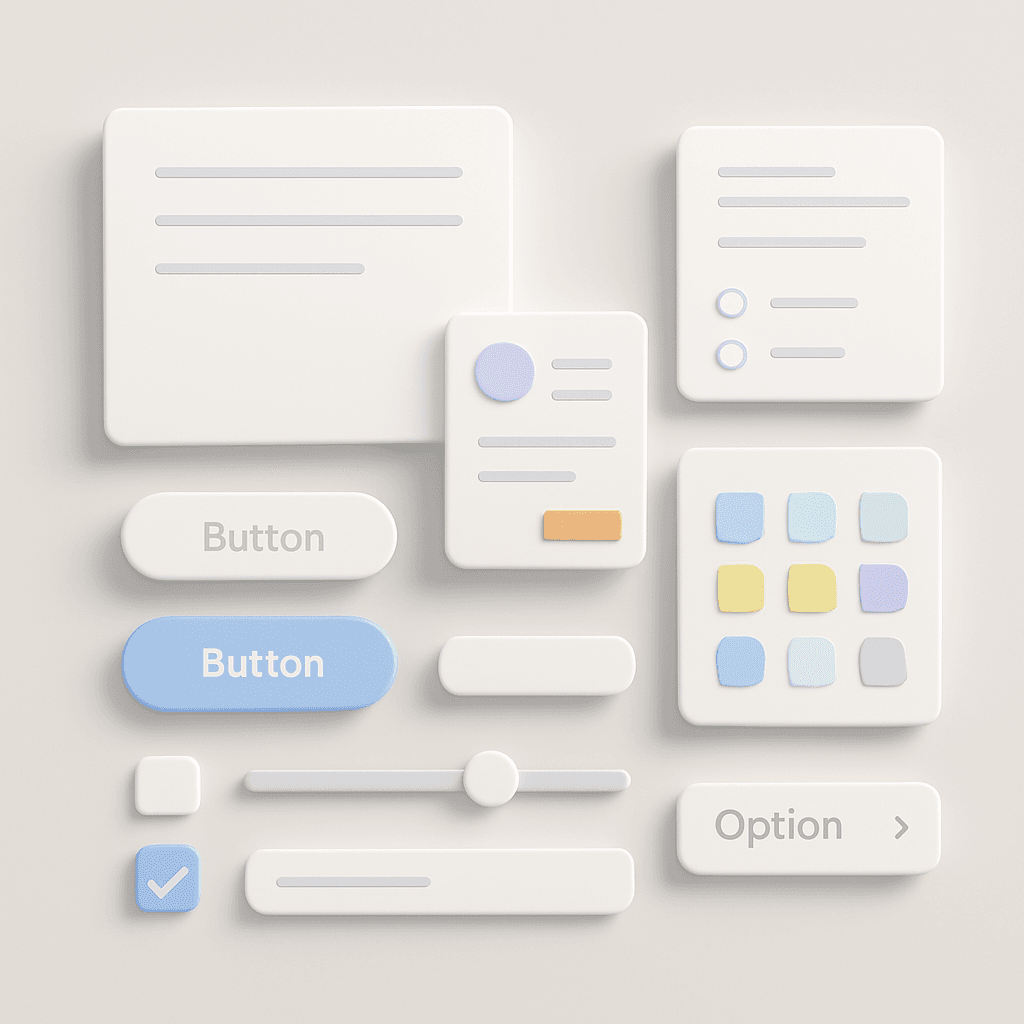
🧩 1. It’s Not About Volume — It’s About Intent
A bloated kit with 250+ screens might sound powerful.
But if 70% of it isn’t relevant to your product, it just becomes noise.
A good UI design kit offers:
Just enough patterns to get started
Clear naming and organization
Modularity so you can scale or reduce as needed
We followed this idea with the Sigma Design System — starting small, with focused patterns, then building out based on real use.
📐 2. Tokens First, Then Components
A kit is more useful when it’s built on design tokens — things like:
Spacing
Type scale
Color roles
Shadows and radius
Tokens let you change the system without breaking it.
They turn a UI kit into a flexible foundation — not a fragile template.
🧱 3. Components Should Be Composable
A checkbox inside a card inside a table inside a modal.
Sound familiar?
Good UI kits are built with composability in mind.
Not just atomic components — but smart, flexible ones that can live across many flows.
Bonus: Look for variants with proper constraints. Nothing slows you down like breaking a button layout mid-handoff.
📚 4. Documentation > Decoration
Some kits are beautiful. But if there’s no guidance on how to use them, they become more of a portfolio piece than a team asset.
Helpful kits include:
Usage guidelines
Naming conventions
Do’s and don’ts
Accessibility notes
That’s why we prioritized documentation in User Psychology 3 — even though it’s not a UI kit, the idea is the same: visuals are nothing without context.
🧠 5. The Best Kits Reflect a Design Philosophy
The kits we return to over and over again aren’t just structured — they’re opinionated.
They reflect how the creators think about space, clarity, and interaction.
If you're building your own, that’s your edge:
Create a system that reflects your team’s personality and product culture — not just Material or Apple guidelines.
💬 Final Word
A UI design kit is more than a file. It’s a starting point — one that shapes how your team builds, ships, and communicates design.
Don’t look for the flashiest one.
Look for the one that helps you think faster and design better.
If it makes your work easier tomorrow than it was today — it’s a good kit.
2025 Sigma. All rights reserved. Created with hope, love and fury by Ameer Omidvar.