UI Kit Checklist: What Every Designer Needs in 2025
Apr 18, 2025
A UI kit should make your work faster — not heavier.
But too often, kits are bloated, inconsistent, or half-finished.
Whether you're building a kit for your team or choosing one from the community, this UI kit checklist will help you figure out what really matters.
Let’s break down the essentials.
🧱 1. Foundation Styles
Before you get to components, make sure the foundations are clear.
Color palette with roles (not just hex codes)
Type system (font styles, weights, use cases)
Spacing scale (8pt system, vertical rhythm)
Grid system (columns, breakpoints, gutters)
Iconography set (consistent size and style)
Shadows, radii, and borders defined
Pro tip: Use Sigma Design System or Tokens Studio to turn foundations into reusable tokens.
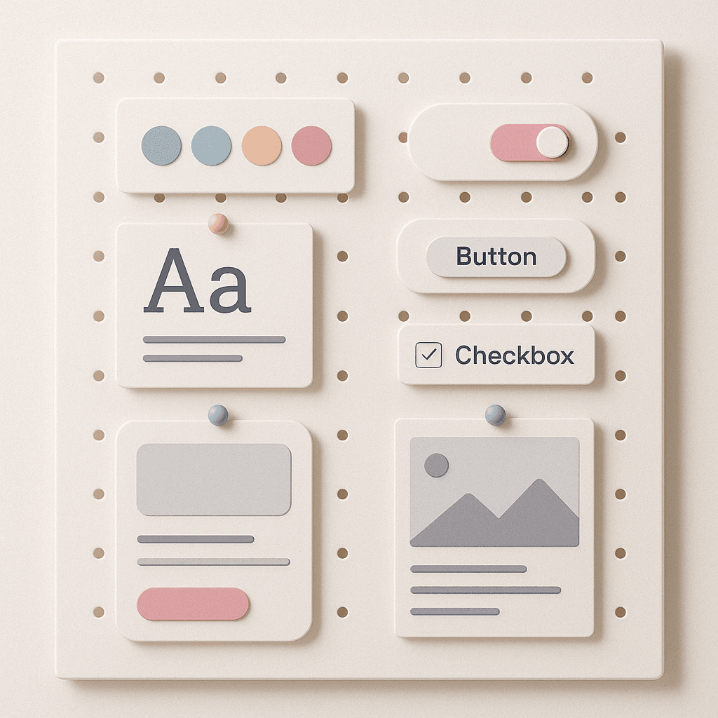
🧩 2. Core Components
This is the heart of your UI kit. Think reusable, scalable, and clean.
Buttons (primary, secondary, ghost, disabled, loading)
Inputs (text fields, dropdowns, checkboxes, radios)
Modals, popovers, toasts
Cards and content containers
Navigation: tabs, sidebars, nav bars
Lists, tables, accordions
Loaders and empty states
Mobile responsiveness / variants
Each component should be:
Properly named
Grouped into logical categories
Built with auto layout (if using Figma)
Easily swappable between states and variants
🧪 3. Interactive States
A kit isn’t usable unless it thinks about behavior.
Hover, focus, active states
Disabled and loading versions
Validation messages for inputs
Animations (if relevant)
Light & dark theme support (optional but ideal)
If you want to go deeper into how behavior affects usability, check out User Psychology 3. It connects interaction design with real human behavior — a perfect addition to any UI kit.
📦 4. Real Content Examples
Placeholder content is fine for structure — but your kit should also show real use.
Sample cards with actual copy
Forms filled with natural text
Product pages or dashboards with structure
Screens with consistent tone and flow
You’re not just designing components — you’re setting tone, rhythm, and trust.
📚 5. Documentation & Notes
Even the best UI kit becomes confusing if people can’t understand it.
Component naming guidelines
Usage notes per component
How to detach/swap/use properly
Do/Don’t examples
Link to full design system (if one exists)
You don’t need a full website — but some in-file guidance can go a long way.
💬 Final Thought
A great UI kit doesn’t show off — it serves.
It’s not about having 200 components.
It’s about having the right ones, built in a way that helps teams design faster and more consistently.
Use this checklist to review what you have — or guide what you’re about to build.
Because when your UI kit is clean, thoughtful, and well-documented, your product will reflect it.
2025 Sigma. All rights reserved. Created with hope, love and fury by Ameer Omidvar.